WE Are best
Scope: Brand Identity, Branded Collateral, Custom Website Build, Marketing, Ongoing Brand Maintenance
Client: Mijasu
Programs: Adobe Creative Cloud, Framer
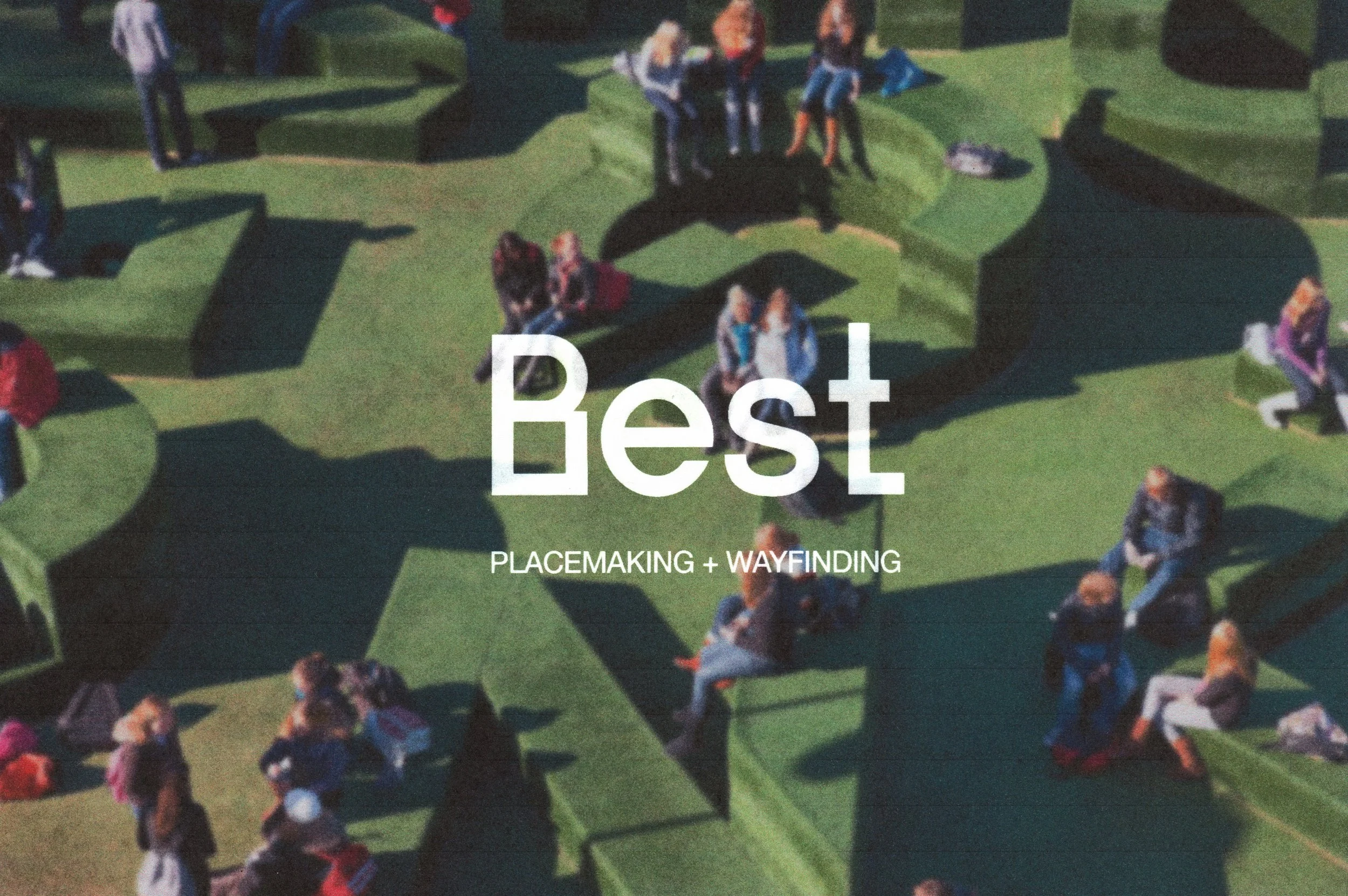
Project: We Are Best has spent over 20 years delivering some of Australia’s leading placemaking, wayfinding and experiential design solutions. I led the full brand identity redesign overseeing creative direction, brand system development, collateral, website build, marketing and ongoing brand maintenance with a focus on capturing the team’s innovative and people-centred approach.
The new identity is shaped by the qualities curious, personable, intuitive, purposeful and vibrant, reflecting the friendly yet highly skilled nature of the practice. The logo was refined to a clean, confident “Best” wordmark, with its forms inspired by the varied shapes, pathways and journeys that define human-centred experiences in both built and natural environments.
The colour palette pairs a crisp black-and-white foundation with bright highlighter tones that add energy, clarity and direction. These colours are used playfully across collateral—through underlines, accents and adaptable presentation systems allowing the team to tailor palettes for individual clients and project narratives. Typography combines a bold, character-driven primary typeface with a stripped-back sans serif, balancing personality with clarity.
Together, the refreshed brand forms a vibrant, flexible and engaging visual language across all touchpoints, reinforcing We Are Best’s position as a leader in placemaking, wayfinding and experience design.